RM Manifold Group

The Request:
RM Manifold, an industry leader in drafting equipment for industrial HVAC applications, required a comprehensive rebrand. Their existing branding lacked modern appeal and clarity, limiting their ability to effectively communicate with a technical customer base and stand out from competitors.
Scope:
I was responsible for the complete rebranding initiative, including logo redesign, brand positioning, typography selection, color development, style guide creation, and integration of multiple sub-brands. The primary goal was to develop a cohesive and professional brand identity that clearly positioned RM Manifold as an authority in their industry.
RM Manifold Option One:
A traditional, clean, strong, and modern logo fitting the HVAC market. “RM” balances simplicity and professionalism through its angular, bold, and direct design.
The “RM” icon is the most prominent element, with the “R” and “M” cleverly merged into a single cohesive design. The stylization of the “R” incorporates an angular, industrial style, while the “M” blends seamlessly without disrupting the flow.
The use of sharp, angular lines, and flat shapes suggests precision, and engineering, which resonates with RM’s core business.
The small, metallic-inspired, geometric elements inside the “M” resemble mechanical parts or vents, subtly hinting at the HVAC or industrial nature of the business. This minor detail adds depth to the icon, making it more dynamic without overpowering the simplicity of the design.
RM Manifold Option Two:
A classic, bold, and timeless logo that embodies strength and reliability within the HVAC and airflow control industry. The "RM" icon features clean, structured letter forms that create a strong visual presence, balancing tradition with modern simplicity while avoiding overly technical detailing.
Rather than relying on literal HVAC iconography, the design emphasizes bold typography and structure to communicate durability and professionalism. Its classic composition ensures adaptability, making it effective across applications such as architectural drawings, product packaging, and apparel.
By focusing on a refined, authoritative look, this logo establishes RM Manifold Group as a brand that values heritage, craftsmanship, and strength, while remaining adaptable for the future.
Key Elements of the final logo:
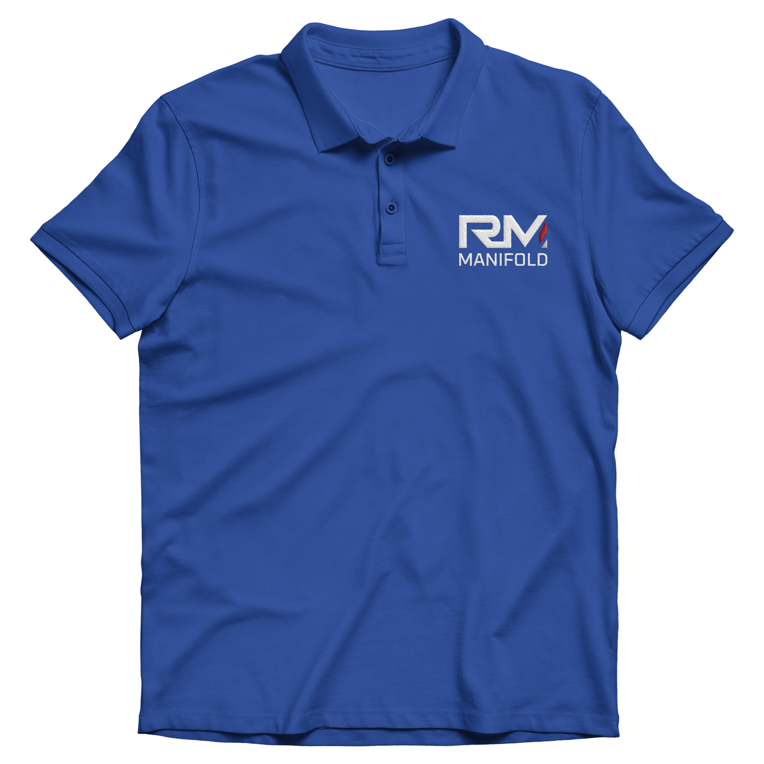
The final RM Manifold logo that went into production included a few minor revisions from the initial version. One of the main changes was the color scheme. The dark grey abstract airflow line, which breaks up the last leg of the "M," was updated to red. This adjustment not only gave the logo a more Americana feel but also aligned it with the colors of their sub-brands, LF Systems and KW Draft, creating a unified brand aesthetic.
Additionally, there was a small modification to the company name. "RM Manifold Group Inc." was used exclusively for legal-facing documents, while the client-facing logo simplified the name to just "RM Manifold." This change streamlined the brand, ensuring a more professional and polished appearance for external communications.
Conclusion
By applying consistent design principles across RM Manifold and its sub-brands, I ensured that each entity remains distinct yet interconnected. This design system strengthens brand equity, making RM Manifold’s sub-brands instantly recognizable while allowing them to serve their respective markets with clarity and impact.

RM Manifold Brand Guide
As the lead creative on RM Manifold’s brand development, I crafted a comprehensive brand guide to establish consistency, clarity, and scalability
across the company and its sub-brands. This guide serves as the foundation for visual and verbal communication, ensuring that RM Manifold
and its affiliated brands maintain a strong, unified identity across all platforms.
Building a Scalable Brand Identity
The RM Manifold brand guide was designed to provide clear, actionable guidelines for designers, marketers, and partners, ensuring seamless brand implementation across digital, print, and environmental applications.
Key components of the guide include:
Logo Usage & Variations
Standardized logo treatments for RM Manifold and its sub-brands (US Draft, LF Systems, KW Draft).
Guidance on clear space, scaling, and proper logo applications to ensure brand integrity.
Color System
A well-defined color palette featuring RM Manifold’s signature blue, red, and gray, designed for high contrast and strong visual impact.
Secondary and accent colors for expanded applications across marketing and digital media.
Typography Guidelines
A carefully curated typographic system that balances modern professionalism with technical precision.
Primary and secondary fonts selected to ensure legibility and brand cohesion across digital and print formats.
Graphic Elements & Iconography
A system of custom iconography and visual motifs that reinforce the brand’s identity.
Usage of angled cuts and geometric patterns inspired by the RM Manifold logo to create a cohesive look and feel.
Photography & Application Examples
Brand-approved photography guidelines to maintain a consistent tone and mood.
Real-world application mock ups demonstrating the brand in stationery, web, advertising, and product branding.
Ensuring Brand Longevity & Recognition
This brand guide was not just designed as a static document but as a living resource that adapts with RM Manifold’s evolving needs. By creating a flexible yet structured system, the brand can scale efficiently across future marketing efforts, sub-brands, and product expansions.
Conclusion
The RM Manifold Brand Guide is a testament to strategic brand thinking and execution, ensuring that the company and its sub-brands maintain visual coherence and market impact. By establishing these guidelines, I’ve helped create a strong foundation for brand recognition, trust, and longevity in a competitive industry.
RM Manifold & Sub-Brand Identity System
Design Philosophy & Consistency
The design strategy follows a structured approach, ensuring that all sub-brands inherit the core DNA of RM Manifold while addressing their specific market positioning. This was achieved by maintaining consistent visual language, typography, color strategy, and structural elements across all logos.
Typography & Structure
The primary font used across RM Manifold and its sub-brands is clean, modern, and bold, reinforcing a sense of strength and reliability.
Each sub-brand integrates an iconic mark that embodies its specific industry while aligning with the overarching RM Manifold structure.
Color & Symbolism
Red, gray, and navy blue serve as unifying elements, ensuring instant brand recognition.
Each sub-brand mark utilizes angular cuts and bold geometric forms, a direct visual link back to the parent company’s identity.
The Signature Diagonal Element
A defining feature across all designs is the angled red and gray diagonal, an element borrowed from RM Manifold's logo. This serves as a subtle but powerful brand signature that visually ties each sub-brand to its parent company.
Sub-Brand Breakdown
US Draft
The shield design conveys protection, structure, and dependability, aligning with the brand’s purpose.
The "US" typography is custom-built, ensuring the letter forms maintain the strong, industrial feel of RM Manifold.
The red and gray diagonal mark remains a common branding thread across all sub-brands.
LF Systems
LF Systems’ identity takes a more architectural, technical approach.
The geometric grid-like structure reflects precision, engineering, and technical innovation, all core values of the brand.
The angular “LF” monogram follows the bold, structured letter form style set by RM Manifold.
KW Draft
Designed to reflect the kitchen and hearth industry, KW Draft integrates a home-like framing device around the letters.
The red framework symbolizes structure, reliability, and the concept of drafting in architectural design.
The open-frame concept ensures the logo is both distinctive and aligned with RM Manifold’s overall visual philosophy.